March Madness is in full swing and I’m already near the bottom of our office bracket challenge. But if I believe in one thing during this tournament, it’s the underdog. So here’s to hoping things turn around.
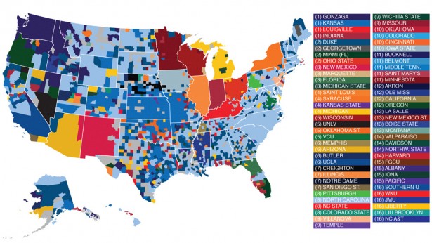
Michael Bailey, an economist on Facebook’s Data Science team, compiled an analysis of the more than 1 million Facebook user’s who have liked a page for one of the 68 teams in the NCAA tournament. He then used this data to create several infographics showing which teams are popular in which parts of the United States. While North Carolina is clearly the most “liked” in the country according to the map, it seems that some schools didn’t feel any love, with 17 of the tournament teams left completely of the map.
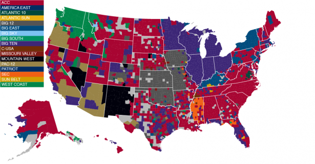
Bailey breaks down the map further by providing a comparison of popular athletic conferences:
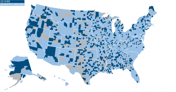
And even further by showing how the nation fares with one of sports greatest rivalries – Duke vs North Carolina:
We at Invisible Children love maps. We believe in the power that cartography and real-time data have in our ever-advancing world. That’s why we partner with the The Resolve LRA Crisis Initiative to utilize this technology through the LRA Crisis Tracker. This technology provides updates on the LRA attacks, killings, and defections. To learn more the LRA Crisis Tracker click here.
(Photo credits: Facebook)
Think people should hear about this?