If you haven’t seen it yet, check out our new website. We got a facelift, and we are looking fresher than ever (cue the popped collar).
Our web team has been hard at work creating the most interactive, easy-access site we’ve ever had. They did a great job (I mean, just look at this blog page) and we want to highlight their hard work and the fun features of the new site.
1. Welcome to your own mini-movie
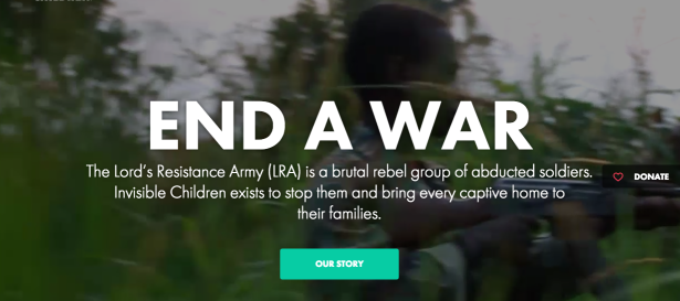
Landing on our page launches you into a movie. If you’re like me, you got goose bumps and spent the next five minutes watching the mini-movie over and over again.
2. War is hell
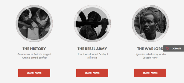
The LRA conflict spans 30 years and 5 countries. It can get complex, but with our new Conflict Overview page, the war is broken down into digestible snippets (crumbs if you want to continue the food metaphor).
3. Show me the money
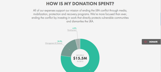
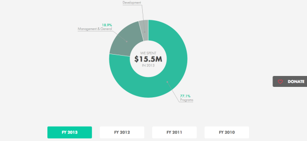
If you haven’t asked yourself, you’ve probably at some point heard someone ask about Invisible Children’s financial situation. We get it — people want to know where their money is going. Now, it’s easier than ever to track your donation and understand where our money comes from and where it goes.
4. All the programs
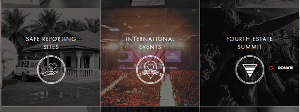
We do a lot. 20 different programs at once. It’s hard to keep track of, but our new programs page showcases our work better than ever. All 20 programs are laid out with cool pictures; it’s easy to navigate and gives a snapshot of every program in one place. Added bonus: when you place your mouse over one of the program pictures, it goes from black and white to color.
5. It’s easier than ever to get involved
As Jess, one of the superstar creators of the new site, puts it, “We didn’t have any pages dedicated to ‘getting involved’ on our last site and now we have three! I think those pages really put some good resources into people’s hands and let them know that we’re here to help.”
Think people should hear about this?